After

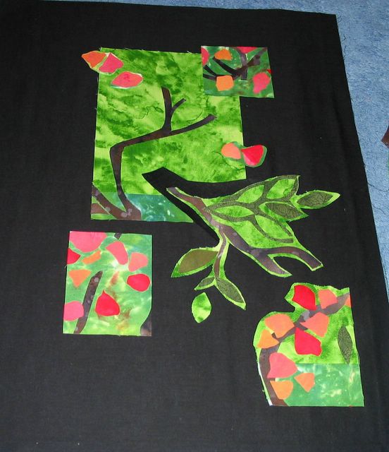
Here is one new version of the no-contrast piece. I still may add more, but I think I like it less busy like this, and of course the contrast is better. If I pick this one, then I will need to do something really interesting with the quilting in all that empty black space. Or not. It is a work in progress, and I am thinking of changing the shape to non-square and perhaps adding some different colors. It is a work in progress....
5 comments:
The black looks kinda blah to me. Try some of that red that you used in the 'apples'. Green against red will produce simultaneous contrast and be very zingy.
But then I am not a fan of 'quilt by committee', so do your own thing and you will be happiest.
I wonder how it would look if you left a narrow black outline on the pieces you have cut (which are interesting shapes!) and then put that on another colored background (red? gold?) I don't know if I would like it or not, but it would be interesting to see...
Lisa, its so funny that you would say just that. I have been thinking about that narrow black outline thing ever since I read Pam's blog on Laura's "woodcut" class. Besides Pam and Laura, I know there are several others who have use the black outline to good effect. Jen
This looks like it could be the start of something really exciting. Keep building on it!
What a great site »
Post a Comment