Today's project

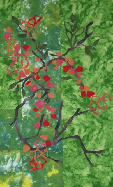
This is what I worked on today. The background is pieced from hand painted and hand dyed fabric. The forground shapes are mostly cut from hand painted fabrics, but I used some brown and dark green texture from the store bought stash. To me, this is not "popping", and I thought of introducing more yellow shapes, or taking a cue from Sonji and cutting it apart and assembling with other colors. Specifically, I thought of cutting it into squares and rectangles of different sizes and framing them with contrasting fabric. We'll see what develops. Comments welcome.
5 comments:
Jenny, all the fabric and cut outs are beautiful, but maybe they are cancelling one another out. My rule of thumb is that something has to be ugly in my composition. No one else may notice, but it's always in there. I'll use an off looking color or odd shape, some direction stitching or little shapes to activate the space.
That background fabric is lovely but too busy to reveal the unique cut out shapes. They can hold their own, so perhaps a less patterned background and something with more contrast to make it pop. Yellow is a good idea. Or even a lilac or sky blue (riskier, but could be fun). You HAVE TO let the shapes scream! They are the stars.
Sonji, yes I also think the background is just too busy. Since I posted, I chopped it up, but I am still auditioning other fabrics.
There is no stitching at all yet, so that is another element that can be used to help. I never thought of something "ugly", I really don't notice that in your work, but I will take a closer look. What you are saying is something for more contrast, clunky vs graceful or something a little odd? Jen
Jen, my eye is drawn to the space where the white and blue peek through then I followed the shapes, so I was also thinking the background needed to provided higher contrast.
Yes, Jenny...something clumsy or clunky may be a better term than ugly.
I can't wait to see what you try. Isn't chopping fun?
Oh now I'm intrigued and I'd like to see how it's looking now that it's cut up. I think contrast was the main problem to begin with. I remember a jr. high photography teacher showing us a picture of a geranium and noting that the green leaves and the red flowers looked exactly the same in a black and white picture because they were of the same hue. Your green background and red blossoms might have the same trouble. New pictures please!
Post a Comment